Projects
Advertising
TD Bank
As a Marketing Manager, one of the biggest challenges in developing national and local campaigns for TD was striking the right balance between consistency and customization. The national campaign needed to deliver a strong, unified brand message that reinforced TD’s values and credibility, while local campaigns had to adapt that message to reflect community needs, cultural nuances, and regional priorities. Ensuring both levels worked seamlessly together required careful coordination across teams, maintaining brand integrity while allowing enough flexibility for local relevance and impact.
Noor Jewellers
Developing advertising materials for Noor Jewellers required creating a visual identity that seamlessly conveyed both high-end luxury and cultural elegance. We produced a range of print and digital campaigns that demanded consistency and refinement across every channel. To support this, I created detailed branding guidelines defining design principles, color palettes, fonts, and photography standards—ensuring every piece showcased the elegance of the jewelry while honoring the cultural richness at the heart of the brand.


CRM Tools
Homes to Zero
The challenge in developing a sleek CRM tool for Homes to Zero was presenting complex data—greenhouse gas assessments, retrofitting steps, and progress tracking—in a way that is both intuitive and visually engaging. The tool needed to show the journey of one or multiple homes, highlighting current progress, achieved benefits, and next steps. It also had to remain flexible enough for homeowners seeking a simple overview, and for agents or contractors managing many properties. Creating a clean interface that makes technical sustainability data approachable while adaptable across user types required careful planning of visual hierarchy, iconography, and user flows.
RBC (Chief Data Office)
Designing a clear and impactful CRM tool for the Chief Data Office came with the challenge of building a dashboard that delivers layered information tailored to user levels. Senior executives needed high-level insights with the ability to drill into details, while managers and analysts required more granular views. At the same time, different business units needed controlled access to ensure they only saw relevant data. The tool also had to be simple and intuitive, making complex information easy to understand and encouraging adoption without the burden of a lengthy change management process. Balancing clarity, hierarchy, accessibility, and usability was key to its success.


Events
TD Securities
TD Securities event invitations require balancing clarity with creativity. Clean, engaging layouts must align with TD’s brand standards through consistent typography, color, and structure, while thoughtful design details capture attention and elevate the experience. The result is invitations and programs that are both functional and memorable, reinforcing TD’s professionalism and attention to detail.


Infographics
RBC (Chief Data Officer)
Infographics are a powerful tool in the Data Domain Playbook because they transform complex information into clear, engaging visuals. For RBC’s Chief Data Office, they make abstract concepts more approachable by highlighting key insights, processes, and relationships in a way that is easy to understand at a glance. Well-designed infographics not only improve comprehension and retention but also enhance the overall look and feel of the playbook, making it more inviting for readers. By combining education with visual appeal, they ensure that important data principles resonate with both technical and non-technical audiences.
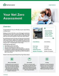
Homes to Zero
Infographics are essential to the Net Zero Assessment because they translate complex data about greenhouse gas emissions into clear, engaging visuals that homeowners can easily understand. By showing how a home’s footprint compares to global averages, infographics create context that makes the information meaningful and relatable. They also break down the steps toward achieving net zero in a way that feels approachable rather than overwhelming. Beyond education, well-designed infographics make the assessment visually appealing, ensuring homeowners stay engaged while gaining the knowledge they need to take informed, impactful action.


Social Media
Homes to Zero
For start-ups like Homes to Zero, the challenge is cutting through a crowded sustainability space. Every post must educate, build trust, and connect emotionally. Illustration simplifies complex ideas, creates a unique identity, and helps stand out while staying relatable.


Email & Newsletter
RBC (Chief Data Office)
Creating engaging HTML newsletters for a bank requires balancing brand integrity with innovation. The challenge lies in developing visually compelling templates that stand out in crowded inboxes, while motivating internal staff to read, respond, and stay connected. By pushing the creative boundaries of RBC’s brand standards thoughtfully, newsletters can remain consistent yet dynamic, delivering content that is both professional and engaging.


Magazine
Designing a magazine for an interlocking company means creating a visual narrative that blends inspiration with clarity. Bold photography of completed projects highlights aesthetic impact, while detailed shots of the brick emphasize material quality. Infographics simplify complex installation steps, ensuring the layout is not only visually striking but also functional showcasing design as a tool to both inspire and inform.
Designing RBA’s magazine meant turning complex tax insights into engaging content. By blending illustrations, photography, and clear layouts, I created a publication that simplifies dense material while showcasing 30 years of best practices with impact and clarity.
Designing an engaging newsletter for UPS meant overcoming the challenge of working with a copy-heavy layout. With limited flexibility in structure, the goal was to keep the design visually appealing while ensuring readability. By strategically integrating illustrations and imagery, the newsletter not only supported dense content but also delivered the message in a more engaging and accessible way.


Resturant
LAO THAI
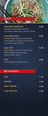
As a graphic designer, one of the biggest challenges in developing the menu, grand opening flyers, ads, loyalty program, and other marketing materials for the Laos Thai restaurant was balancing a sleek, high-end aesthetic with authentic cultural elements. The client wanted a refined feel while still celebrating Laos culture, which meant carefully choosing typography, colours, and textures that felt elegant without being overwhelming. The biggest focus was letting the food photography take center stage, highlighting the richness, freshness, and artistry of each dish while ensuring that the supporting layouts elevated rather than distracted from the images. Achieving this harmony across different formats, from menus to promotional campaigns, required a consistent visual language that conveyed sophistication, cultural pride, and appetite appeal.


Illustrations
RBC (Chief Data Office)
Creating an illustrated character for the Chief Data Office became a powerful tool for strengthening internal branding while making complex topics more approachable. The character provided a consistent, recognizable identity for the CDO team, helping to humanize their work and build stronger engagement across the organization. More importantly, it served as a visual guide to deliver technical and often abstract data concepts in a friendly, relatable way, transforming dense information into clear, engaging stories that encouraged understanding and connection with a wider audience.
Homes to Zero
Crafting an illustrated character and cohesive iconography for Homes to Zero offered an approachable way to elevate brand identity and boost engagement. The character added a human touch that made the mission relatable, while tailored icons ensured visual consistency across all channels. Infographics simplified complex green energy processes like the mechanics of heat pumps into clear, accessible visuals, helping audiences of all ages and technical backgrounds quickly grasp the benefits. By merging clarity with design, we transformed technical detail into compelling storytelling that builds trust and drives adoption.
Personal
As an illustrator, I enjoy capturing precious moments in my kids’ lives through playful illustrations that turn memories into lasting art. Each piece is both a celebration and a chance to refine my skills, blending joy with growth as I experiment with style, color, and detail.


